2026.07.16 - Intentional interface

Last modified 7/16/2026

Scaffold is a series of intentional choices. We spotlight some of them below.
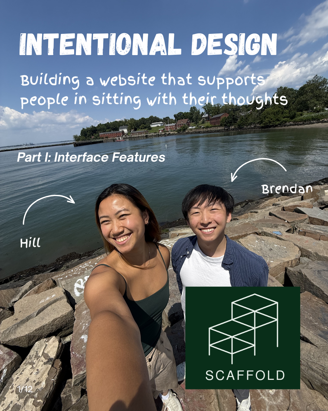

Slide 1: Intentional Design — building a website that supports people in sitting with their thoughts. Part I: Interface Features. A photo of Hill and Brendan on a rocky shoreline.
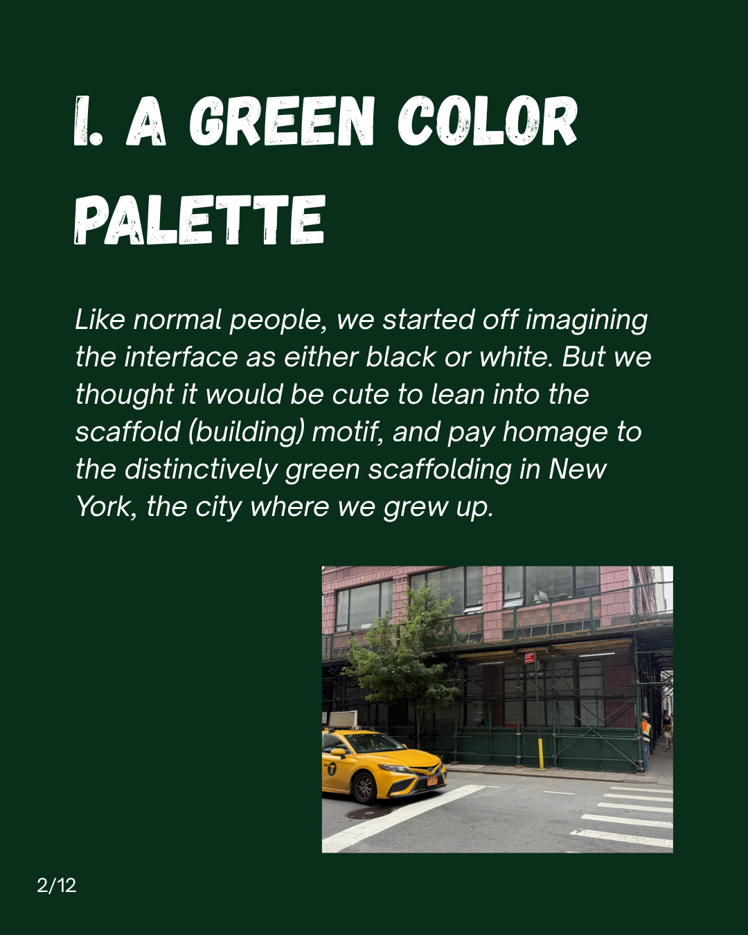
Slide 2: I. A green color palette. Like normal people, we started off imagining the interface as either black or white. But we thought it would be cute to lean into the scaffold (building) motif, and pay homage to the distinctively green scaffolding in New York, the city where we grew up.
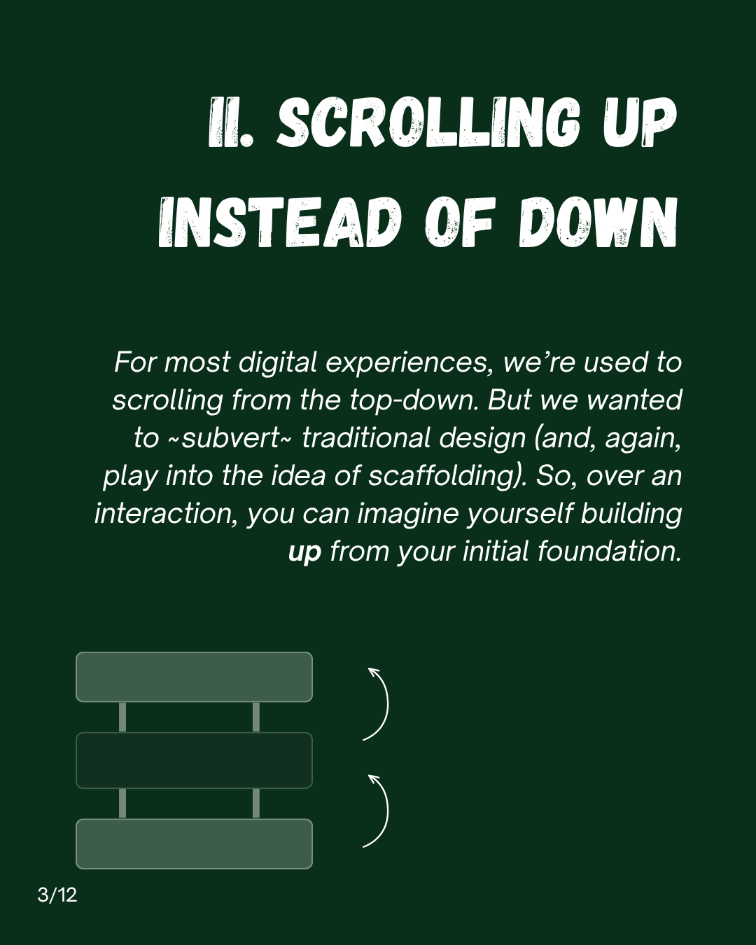
Slide 3: II. Scrolling up instead of down. For most digital experiences, we're used to scrolling from the top-down. But we wanted to subvert traditional design (and, again, play into the idea of scaffolding). So, over an interaction, you can imagine yourself building up from your initial foundation.
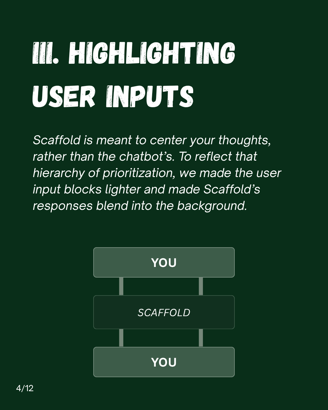
Slide 4: III. Highlighting user inputs. Scaffold is meant to center your thoughts, rather than the chatbot's. To reflect that hierarchy of prioritization, we made the user input blocks lighter and made Scaffold's responses blend into the background.
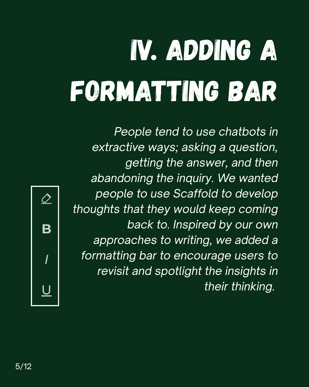
Slide 5: IV. Adding a formatting bar. People tend to use chatbots in extractive ways; asking a question, getting the answer, and then abandoning the inquiry. We wanted people to use Scaffold to develop thoughts that they would keep coming back to. Inspired by our own approaches to writing, we added a formatting bar to encourage users to revisit and spotlight the insights in their thinking.
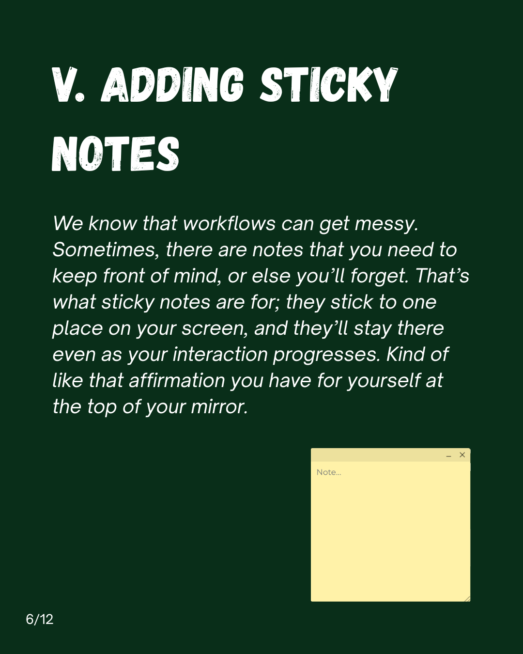
Slide 6: V. Adding sticky notes. We know that workflows can get messy. Sometimes, there are notes that you need to keep front of mind, or else you'll forget. That's what sticky notes are for; they stick to one place on your screen, and they'll stay there even as your interaction progresses. Kind of like that affirmation you have for yourself at the top of your mirror.
Slide 7: VI. Allowing users to decide the end. Scaffold is designed to offer to conclude when it seems that the user has addressed their stated goal (usually, it takes around 20 user inputs). However, we recognize that Scaffold's judgment on progress may not align with the users. So we added a check mark feature that the user can click to indicate their satisfaction with the interaction.
Slide 8: VII. Ending with takeaways. After you click the checkmark, you will be prompted to add your key takeaways from the interaction. There aren't enough digital spaces that encourage us to reflect. So we sought to build that process directly into our product. At the same time, we know not everyone likes reflection, so we've made that step optional.
Slide 9: VIII. Allowing interaction export. Keeping with the theme of using Scaffold to preserve your ideas, we wanted to give users a way to easily save and recall their interactions.
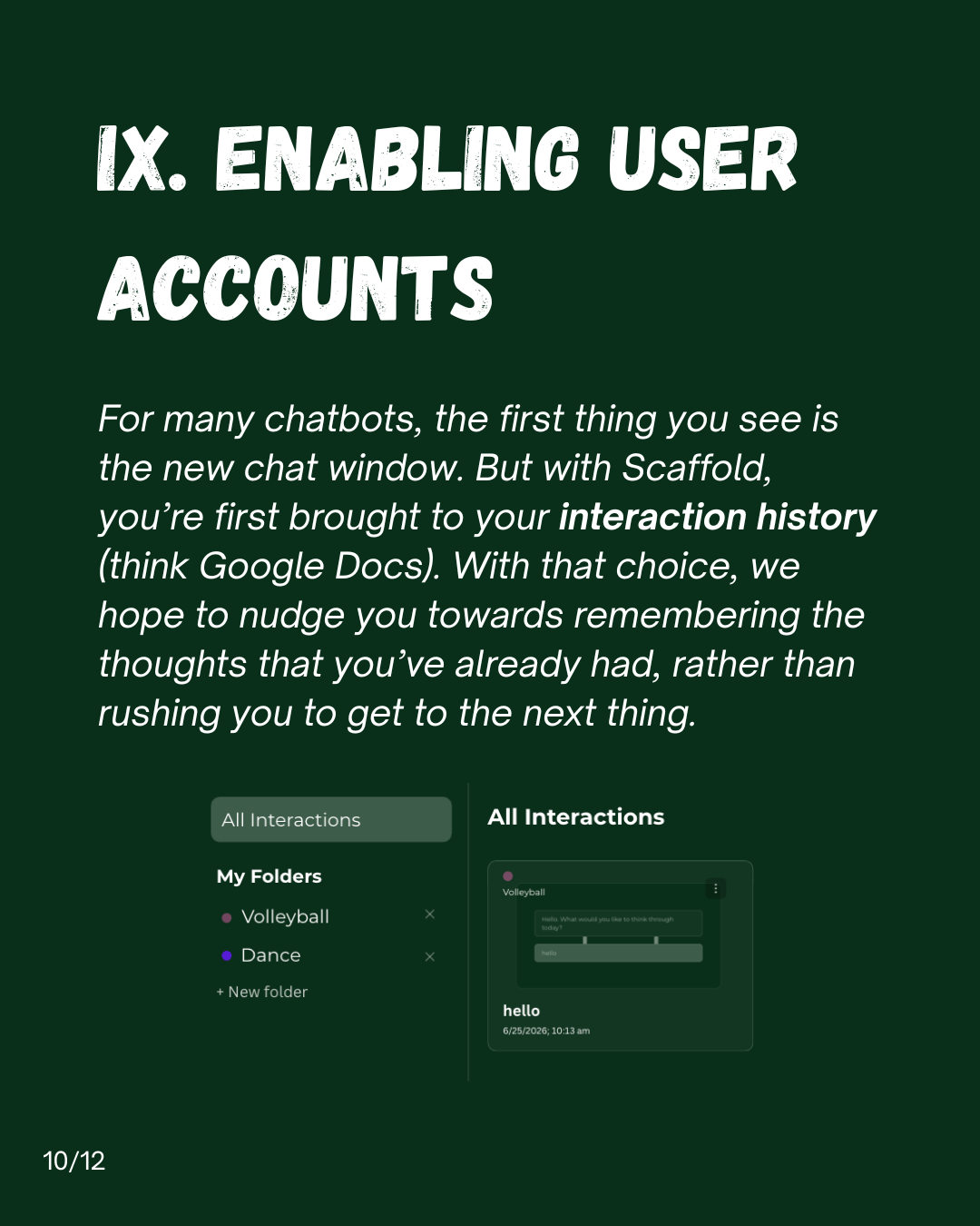
Slide 10: IX. Enabling user accounts. For many chatbots, the first thing you see is the new chat window. But with Scaffold, you're first brought to your interaction history (think Google Docs). With that choice, we hope to nudge you towards remembering the thoughts that you've already had, rather than rushing you to get to the next thing.
Slide 11: X. Linking the info and interaction sites. Scaffold is firmly rooted in our values and background, and we want users to be able to readily access that information. Thus, we've added buttons visibly linking our informational and interaction sites.
Slide 12: Scaffold is now live at thinkwithscaffold.com. Try it out and let us know what you think! — Brendan + Hillary

1 of 12